Sabtu, 28 Januari 2012

Bauhaus Diners

The Nighthawks, 1941, Edward hopper
Yesterday, an online artist friend and I were having virtual coffee when the conversation strayed from painting to the not totally unrelated topic of diner decor. He described his local burger place  as: "White laminated plastic surfaces everywhere, lit by a dreadful combination of cold white fluorescent tubes and unbelievably long neon strips in predominately pale blue with pink accents. The neon makes the place as inviting as an abattoir, (French for slaughterhouse) and as comfortable as a fishmonger's marble slab. The place makes the diner in Hopper's Nighthawks look kinda homey." He concluded by adding contemptuously, "Modern interior design, queen of the arts--Hah!  Bring back the Bauhaus." I didn't want to burst his bubble by mentioning it at the time, but much of what he describe from his burger palace was pure Bauhaus. (The Bauhaus, by the way, was a highly influential German school of architecture, painting, interior, and industrial design operating from 1919 to 1933.)

Bauhaus rectilinear lines and simplicity, replete
with neon signage, are evidenced in this 1950s
era diner in Hasbrouck Heights, New Jersey
In the early 1950s, diners (not known as fast food back then) adopted and adapted many Bauhaus design principles to denote a "squeaky clean" efficient look. This was totally at odds with the "greasy spoon" look (and taste) which many lunch spots had at the time, having grown out of the neighborhood bar and grill (not unlike the impressionist hangout, Paris's Cafe Guerbois). For example, in the U.S., we have an institution which men tend to love and women often hate called the White Castle (below). The place is designed to look a little like a white porcelain steel castle, with a small tower, crenelated cornice and all. Inside, the ambiance is a cross between a bus station and an operating room. The burgers are tiny, salty, little squares, paper thin, with minced onion on top, served on cute little square buns (ketchup and mustard to taste). They are about three bites each and known to give you gas big time. And, in spite of what I've just described, they are shamefully delicious. People often consume a dozen at a time. I think Burger King use to have something similar called Burger Buddies.

Before there was a MacDonalds, before there
was Burger King, almost before there was
a Bauhaus, there was White Castle. The
5-cent burgers and the architecture date
from the early 1920s.
Though White Castle "architecture" is something of a departure from Bauhaus design, the rationale has something in common: The world is a dark, dirty place, come inside to our pristine, brightness for a quick, healthy (yeah, sure) lunch; and while you're at it, take home a bagful for dinner. The wife and kiddies will love you for it (cold, greasy little hamburgers?...the kids maybe, but the wife?).  Believe it or not, in some neighborhoods, these establishments are treated as something akin to an ethnic culinary shrine. And in many neighborhoods, they are a sanctuary of cleanliness and even safety in the midst of poverty, crime, and despair. In Columbus, Ohio, there was an old White Castle in danger of being torn down. The local populace revolted, had a big protest rally, and started petitions. In the end, restaurant was moved a few hundred yards, restored, and even placed on the register of historic structures, which means this dubious architectural masterpiece will be preserved for something like an eternity or longer.
Photo by Daniel Schwen
The interior of this modern day
 Brooklyn, New York, diner is not
without Bauhaus influences.
However, this New Zealand Burger
King may be pushing the Bauhaus
 50s thing a bit too far.

Jumat, 27 Januari 2012

Anthony Van Dyck

In today's world it would be hard to conceive. It would be the equivalent of closing up the National Gallery of Art in Washington, loading up a couple dozen semi-trucks with its contents, and carting them all off to Sotheby's in New York for the grand art auction to end all grand art auctions. Yet in the year 1650, in London, something like that actually happened. The art collection of England's King Charles I was sold at auction. A few pieces were held back of course, some portraits of the monarch, his Stuart ancestors, his father, James I, and a few other historic pieces, but 90% of it went on the block.

Self-Portrait with a Sunflower, after 1633,
Sir Anthony Van Dyck
Of course to understand this radical turn of events in the art world, it might be helpful to recall that the king's head itself had, just the year before, also gone on the block...in this case the chopping block. In the culmination of a decades old rivalry between the monarchy and his enemies in parliament, the king lost. Regicide was a fact of life in Europe at the time, one of the chances one took in becoming king. The dissolution of his magnificent art collection was, in a sense, a symbolic act representing the dissolution of the monarchy itself. There were economic reasons too, of course. There were war debts to pay off, and if you can imagine it, the British government was broke. Some British generals, noblemen, and other court hangers on grabbed a few pieces for their magnificent country manors, but by and large the pieces mostly left the country. Art collecting had become all the rage in Europe at the time, and the various ruling families were known by the company they kept in terms of art and artists.  And the greatest, most collectible artist of this time in all of Europe was Anthony Van Dyck.

The Villers Brothers, 1635,
Sir Anthony Van Dyck
Sir Anthony (Charles I had knighted the Flemish painter in 1633) spent eight years in London, working full time for the monarchy.  Born in 1599, in Antwerp, Van Dyck was a child prodigy student of Peter Paul Rubens. By the time he was eighteen he had his own studio, turning out portraits, religious, and mythologic pieces with an effortless skill even Rubens found remarkable. He spent seven years studying in Rome where his dignified, insightful, yet warmly informal portraits of aristocracy won him an international following.

Triple Portrait of Charles I, 1635, Sir Anthony Van Dyck
Lured to London by the promise of a knighthood, his own palatial studio, and a stipend generous even by today's standard's, Van Dyck proved not only to be a prodigy but also prodigious. In the eight years spent in London, he produced over 700 portraits, an almost unbelievable one per week. And they're all the more remarkable for their high quality. His portraits of the king are solemn, yet regal only in his depiction of the king's bearing, unlike the flamboyant caricatures of royalty Rigaud employed in painting Louis XIV. Van Dyck's Triple Portrait of Charles I from 1635 is typical, yet amazing in its depiction of the monarch in profile, full faced, and three-quarter view, all on the same canvas. Charles I was a man highly conscious of his own image, his own behavior, and a king given to ruling by example. Van Dyck was, in a sense, his PR man, and a very good one at that. Van Dyck died in 1641.  One has to wonder whether, if his image maker had survived, the king might have also.

Kamis, 26 Januari 2012

Anni Albers

The German Bauhaus of the
1930s was probably the most
influential force in 20th
century art.
Perhaps it's my fault in being a man, but I get the feeling sometimes even women don't totally realize how far female artists have come in the past century. At a time when they may even outnumber their male counterparts, I think we all have a tendency to overlook just how far they've come in leveling the creative playing field even during our lifetimes. Anni Albers is an interesting example. She was born Annelise Fleischmann in Berlin something over 100 years ago, which makes her a convenient barometer for measuring women's role in the arts. At the age of twenty-two, she found her way to the Bauhaus in Dessau, Germany, one of the few art schools or any stature where women were even admitted at the time. The Bauhaus was notable for having an extremely liberal overview of the fine arts and crafts, and their interrelationship to industrial design and production. It was also probably the closest thing around to our current concept of women as being the equal of men in the arts. Anni completed the grueling foundations course, but despite the institution's egalitarian leanings, was barred from architecture, wall painting, and furniture workshops because the course of study was considered too demanding for their fragile physiques. Instead, she found herself seated behind a loom.

Anni and Joseph Albers
Anni Fleischmann became a Bauhausfrau. She married the painter Josef Albers who was thirteen years her senior. They were an odd match. She was the daughter of a Jewish furniture manufacturer, he the Catholic son of a skilled laborer from the coal-mining Ruhr Valley. They both remained with the Bauhaus, her work with the weavers workshop laying the groundwork for much of what we consider modern textile design fundamentals of this century. Bauhaus concepts tended toward simple rectilinear design, which made them a perfect match for the rectilinear qualities imposed by looms upon woven textiles. She brought the "less is more" Bauhaus mantra to her weaving, while employing subtle elements such as knots, twists, or irregularities, and materials such as raffia, fiberglass, jute, horse hair, harnessmaker's thread, metal thread, foil, Lurex, and plastics in her work. Today, weavers take all these things for granted.

Though she may not have written "the"
book on weaving, Anni Albers certainly
wrote "a" very influential treatise on the
subject.
In 1933, as Hitler closed the Bauhaus, Anni and her husband were invited by American architect, Phillip Johnson, to emigrate to the United States where they spent sixteen years teaching at the fabled Black Mountain College near Asheville, North Carolina. Later they moved to Connecticut where Josef Albers taught at Yale until his death in 1976. Anni Albers had her first one-woman show in 1949 at the Museum of Modern Art, the first textile artist ever to be so honored. She continued to design and weave fabrics of all kind until her death in 1994 at the age of 94. Her life was a living, breathing testament to the changing place of women in the arts all around the world. Today, many of her designs are still commercially available. 
Silk Wall Hanging, 1926,
Anni Albers
Second Movement II, 1978, Anni Albers

Rabu, 25 Januari 2012

Alexei Jawlensky

Alexei Jawlensky Self-Portrait
Sometimes I am amazed at the abysmal lack of depth when it comes to recognizing American artists from the past. Asked to name some American artists, most people don't get far past Rockwell, Wyeth, Gilbert Stuart, Grandma Moses, maybe Jackson Pollock, oh, and Thomas Kinkade. Now there's a mixture. Not much depth but breadth as wide as the whole continent. Actually, I think maybe we Americans are more familiar with artists of world renown than those from our own shores. From that list we might rattle off Picasso, Michelangelo, Leonardo, Raphael, Rubens, Rembrandt, Turner, Van Gogh, Monet--the list is longer but still not much depth. Okay, how about Russian artists? Blank stares. Marc Chagall? Okay, if you say so...

Schokko with Red Hat, 1909,
Alexei Jawlensky

Well, if you'd like a similar list of breadth rather than depth, you might add to Chagall, Kandinsky, Gorky, Malevich, and Jawlensky (above). This is about the one you never heard of, the last one, Alexei Jawlensky (pronounced yaw-LEN-skee, not nearly as hard to say as it looks). He was from roughly the same time period as the others. He was born in 1864, died in 1941, and it's a fair bet they all knew one another. Jawlensky was the son of a Russian army officer. He first exhibited an interest in art in 1880 when he visited an international art exhibition in Moscow and saw for the first time the work of the French Impressionists. He was sixteen.  Kandinsky and others recall seeing the same show and the profound effect it had upon them. This breath of French fresh air (and color) really shook up Russian art. 

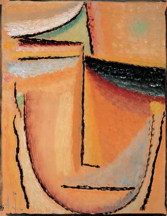
Abstract Head, 1928, Alexei Jawlensky
At the age of twenty-five, Jawlensky began studying at the St. Petersburg Academy under the realist painter, Ilja Rjepin (now there's a name you can forget about pronouncing). One of Rjepin's students was the wealthy Marianne von Werefkin (below, left) whom Jawlensky fell in love with. Rather than Realism though, his painting style veered toward French Symbolism and German Romanticism. In 1896 Jawlensky and Werefkin, along with her housemaid, Helene Nesnakomoff, moved to a suburb of Munich where Jawlensky flirted with German Expressionism, French Fauvism, and behind Werefkin's back, her housemaid, Helene. And while Werefkin gave up her own considerable painting career to promote Jawlensky's, he repaid her dedication by fathering a son, with Helene. And though this Menage-a-trois must have been a strain after the birth of Andreas, the four of them continued living together for another nineteen years before he finally married the boy's mother.

Marianne von Werefkin, Self-portrait, 1910
Portrait of Lisa Kummel,
1929, Alexi Jawlensky
Jawlensky was associated with any number of Expressionist movements of the time, including Der Blaue Reiter, and the Berlin Secession, but he never actually joined any of them, preferring, some might say, to be a movement unto himself. He must have had quite a way with women, for by 1916, even before marrying Helene, another mistress, Emmy Scheyer, also gave up a career in art to support his. In fact, by 1927, he had a whole association of female artists who formed a foundation called "The Association of Friends of the Art of Alexei von Jawlensky" led by Lisa Kummel (above, right) and the painter/art patroness, Hanna Becker von Rath. Despite his obvious popularity with a harem painters of the opposite sex, it didn't keep the Nazi's from banning the display of his increasingly abstract work in 1933, nor from including three of his paintings in the infamous traveling exhibition of "Degenerate Art" which they organized. Eventually seventy-two of his paintings were confiscated and destroyed by the German government before the war.

Selasa, 24 Januari 2012

Alex Katz

Alex Katz
In the latter half of the twentieth century, since the advent of Abstract Expressionism, the tendency in the art world and among the general public has been to divide all artists into two camps--Realists and Abstractionists. Even people who ought to know better fall back on this dichotomy of oversimplification. And the art world especially hates those artists who straddle the fence, sometimes painting realistically, sometimes painting abstractly, as if they were somehow schizophrenic in doing so. Some artists even manage to "straddle the fence" in the same painting. Of course the labeling critics will look at the work and cast it one direction or the other, either Realism or Abstraction, based sometimes, I think, on pure whim. One of the artists whom they love to do this to is Alex Katz.

                                                         Varick, 1988, Alex Katz
Katz was born in 1927, in Brooklyn, later moving to Queens--New York born and bred--still lives there, in fact. His parents were Russian-Polish immigrants, steeped in the arts. He studied at the legendary Cooper Union, practically in his backyard, coming of age in the art world almost precisely at the dawn of the Abstract Expressionist era. By all rights he should have become an abstractionist. He was a contemporary of Pollock, Rothko, Hoffman, Johns, Motherwell, and all the others, but amazingly, any abstract tendencies in his work are strictly formalistic. Perhaps it was because he won a scholarship to study at the Skowhegan (Maine) School of Painting and Sculpture, taking him away from the boiling pot of the New York School right when it was bubbling at its hottest. Not surprisingly, given the environment, he picked up a love of landscape painting, very nearly the antithesis of Abstract Expressionism at the time. 

Ada and Alex, 1980, Alex Katz
Katz's first one-man show was in 1954 at the Roko Gallery in New York. The headlines might have read: "Hometown boy returns and makes good."  Except it wasn't at all like that. His landscapes and poster-like, flattened portraits were quite out of step with the mainstream. It took the passing of the Abstract era and the 1950s before the advent of figural painting and Pop allowed Katz's work hit its stride. It fell neatly into both categories, even though it displayed a number of quite abstract elements.  In the 70's and 80's, he capitalized on this blending. His Varick (above) from 1988 is a prime example, or his Ada and Alex from 1980 (left, a double portrait of himself and his wife). Both are excellent examples of his mature work. In the portrait, an exquisite, design realism dominates. In Varick the five by twelve-foot black canvas seems the ultimate minimal statement, until one begins to inspect the bank of twelve small rectangles in the upper left corner--lighted windows of what appears to be a second story office or lab. Suddenly, the mind flip-flops, making a futile effort to discern the rest of the structure amid the impossibly inky night.

Piers 6, 1998, Alex Katz
The poster-like quality of many of Katz's paintings has led him into the printing field, creating, in collaboration with master print makers, same-size screen prints of his favorite works, all intended to dominate walls just as his enormous paintings do. Unlike many painters who find themselves at the mercy of publishing houses, Katz takes an active, hands-on role in the printing of his works, usually is editions of less than fifty. He has even found occasions when he likes the print better than the original painting. And recently, just to confound the damnable critics, he sometimes goes so far as to veer off into purely abstractionist images such as his Piers 6 from 1998.  Excuse me for playing favorites, but I love an artists who can (and will) do that.  In my own work, I consider the most successful, those paintings that straddle the proverbial fence--Realism which, in its sometimes highly abstract qualities, appeals to those who can appreciate such things, and in its illusional, subjective content, those who can't.

Senin, 23 Januari 2012

Aelbert Cuyp

One of many Chicago Cows having escaped
the slaughter house.
Artists in the city of Chicago a few years ago discovered the cow. Actually, rediscovered might be a better term. With the city's history as the meatpacking center of the Midwest, it's a natural affiliation. Their sculptural versions were the talk of the town. Even some of my friends were involved in this project. Although I've never sculpted one, I've painted a few over the years. I, myself, prefer close-up portraits. There seems to be a certain earnest quality (for lack of a better term) in those warm, almost loving faces. I suppose they'll never make household pets, but I'm sure quite a number of 4-H members have fallen in love with their barnyard pet projects in the past. And where would we be without cows. The milkshake and hamburger, not to mention dozens of fast food chains would not exist without them. In the mid-1600s, a Dutch artists seems to have had a love affair with those of the bovine set; and I dare say no one ever painted more of them or painted them better than an artist by the name of  Aelbert Cuyp (pronounced KIPE.)

River Landscape with Cattle, 1645-50, Aelbert Cuyp
Cuyp never started out to paint cows. He did come from a long line of Dutch painters in and around Dordrecht, Holland, though. His grandfather was a glass painter. His father, Jacob Gerritsz Cuyp, was a portrait painter, especially talented with children, though his landscapes seemed to have been highly prized as well. He taught his son to paint, often allowing the boy to fill in landscape backgrounds as part of his portraits. In addition, Aelbert's uncle (his father's half-brother), Benjamin Gerritsz Cuyp, was quite adept at biblical and genre scenes imitating Rembrandt's use of light and shadow. But Aelbert himself took after several Utrecht painters, including Salomon van Ruisdael, Jan Both, van Goyen, and Saftleven. Jan Both in particular studied in Italy and brought back to Holland the influence of Claude Lorrain. And as much as he might have been the chief public relations force behind the Dutch dairy industry, Cuyp was just as interested in the watery landscapes and clouded, morning or evening light which illuminated them as he was his barnyard friends. He instilled much of the romantic quality of Lorrain's Italian landscapes into their Dutch counterparts, then added cows.
Herdsmen Tending Cattle, 1655-60, Aelbert Cuyp
The cows are always quite dignified, often more so than their human tenders, who often seem to be mere decorations or afterthoughts in his compositions. They are fascinating foregrounds for Cuyp's deep, luminous, airy studies of light, weather, water, and dimly perceived Dutch towns on distant horizons. Some have called Cuyp the rural counterpart to Jan Vermeer. For a man who never traveled more than a hundred miles from his birthplace, there is a very cosmopolitan quality to his painting style that made his work highly prized, not in the Netherlands, but in England where he was an influence upon English painters such as John Constable and J. M. W. Turner.

Portrait of a Girl with Peaches, 1650-60,
Aelbert Cuyp
After the death of his father and brother, Cuyp's work took on a grander scale and began to include portraits as well as landscapes. But in 1659, in a strange twist not unlike what often happened with female artists, he married Cornelia Bosman, a wealthy widow, and from that time on, lacking the financial need to paint, appears to have devoted himself exclusively to the work of the Dutch Reform church. He had a small group of followers who continued his style after his death in 1691, but unfortunately, none of them ever painted any more cows.

Quite apart from cows, when in a "fowl" mood,
Cuyp was not above painting
A Rooster and Chickens, 1651

Minggu, 22 Januari 2012

Adolphe-William Bouguereau


Charity, 1878,
Adolphe-William Bouguereau
All of us who have learned to become fans of the Impressionists delight in reading about their heroic underdog status in French art; and their slow but persistent rise to acceptance during the late-19th century. We take special pride in their eventual triumph over their enemies in the French Academy des Beaux-arts; and point contemptuously at the neoclassical potboilers their work came up against (and usually lost to) at the art cattle-calls known as the Salon. However, I think to appreciate Impressionism we have to also come to some appreciation of Academicism too. To simply say it was 180-degrees opposite is to give it very short shrift. It was, of course, much more than that. We're familiar with the big names, Poussin, Ingres, Cabanel, and a couple more, but one artist of their ilk which we know little about is Adolphe-William Bouguereau. This is not surprising. In the work of Poussin, Ingres, even Cabanel, we can find something to admire, maybe even love. Bouguereau and his work so perfectly fits the mold all the Impressionist (and thus their admirers) came to hate that he's been relegated to obscurity as a sort of malicious, artistic retribution for past wrongs.

Return of Spring, 1886,
 Adolphe-William Bouguereau,
cupids sprinkled like salt.
As I often do, once I "discover" a somewhat obscure artist somewhere, I go to the Web, often only to find, to my dismay, that he or she was even more obscure than I thought. Not so with Bouguereau. I was not prepared for the sheer quantity of his images nor the apparent devotion of his webmaster friends. The man painted something on the order of 700 major works. Frankly, I tackled Bouguereau prepared not to like him. And, indeed, there is a lot not to like. He can be sickeningly sweet, sexist, pretentious, sentimental, and slick. His 1878 painting, Charity (above, left) epitomizes the worst of all these traits. On the other hand, long after I had basically "absorbed" Bouguereau, I found I could not stop looking at his work. He's amazingly fascinating. The man had a deep respect for the nude figure but seldom succumbed to what we might term "gratuitous" nudity, except perhaps in his cupids which often seemed sprinkled like salt over his canvases. His work often displays the sort of sanitized eroticism the Academy was famous for, but like the dominant male audience for whom he painted, I found myself looking at these first. Did I like them all? No, but they led me deeper into his work. And unlike some of his counterparts, the depth was there to plumb.

The Bohemian, 1890,
Adolphe-William Bouguereau,
one of his more admirable pieces.
Bouguereau was born in 1825, spent seven years studying at the Ecole, and graduated winning the Prix de Rome in 1850--three more years studying in Rome. The man new his stuff. Technically, during the last half of the nineteenth century, he may have been the best of his kind in French art. He was certainly the most popular. His portraits, what few there are (left), bear the mark of Ingres but given his time and place, that's to be expected. His classical subjects are heavily weighted with female figures but that too is not surprising. Perhaps weakest, are his religious subjects. The best that could be said of them is that they make for a rich repository of Sunday School images. Unlike Cabanel who actively, even belligerently, battled the upstart Impressionists, Bouguereau seems not to have understood them and was more given to ignoring them. But in the end, he could not. With the ascendancy of Impressionism, especially in the 20th century, his work quickly fell out of favor, prices plummeted, and as a result, in the U.S., just about any museum worthy of the name could afford one. As a result, they're everywhere, they're everywhere! And now, during the past 25 years, they are again appreciated by collectors, not as juxtaposed against Impressionism, but as fascinating art reflecting its era--no better, no worse.

The Flagellation, 1880, Adolphe-William Bouguereau,
a bloodless, Sunday School depiction.